What Is My Screen Resolution
Your Screen Resolution is
⤢
Screen Width
↔ pixels
Screen Height
↕ pixels
Measurements are in pixels (px).
Total pixels on your screen is
Other Information:
| Device Resolution: | |
| Device Inner Resolution: | |
| DPR (Device Pixel Ratio): | |
| Display Dimensions (width × height): | |
| Screen Diagonal: | |
| Color Depth (bits per pixel): | |
| Pixel Depth: | |
| Display Aspect Ratio: | |
| Your Resolution Is: | |
| Browser Viewport: |
# (browser viewport window’s size without taskbars/toolbars/address bars)
# (“) Means inches
Note: This tool shows your screen resolution based on your browser. Results may vary slightly depending on device scaling, zoom level, or system display settings.
Ever looked at two screens side by side and wondered why one feels crisp while the other looks slightly blurry—even when both are “Full HD”?
I ran into this exact confusion while testing different monitors and phones, which is actually why I built whatismyscreenresolution.site. I wanted a simple way to check not just resolution, but how browsers interpret it in real time.
If you’re here just to check your current screen resolution, a live checker will give you the exact values your browser is using right now—no digging through system settings required.
If you’re wondering things like “what is my screen resolution right now,” “what resolution is my monitor,” or even “my screen checker isn’t showing the right size,” you’re in the right place. This tool shows your exact screen resolution, including browser-reported values and device pixel differences.
Check Your Screen Resolution Instantly
Use the live tool above to see your exact screen resolution, including CSS pixels, device pixels, and DPR in real time. It works instantly on desktop, mobile, and tablet, so you can check your screen resolution in seconds.
This is the fastest way to answer questions like “what is my screen resolution right now” or “what resolution is my monitor” without opening system settings.
Quick Answer: What Is Screen Resolution in Simple Terms?
Screen resolution (also called display resolution) is the number of pixels displayed on your screen, written as width × height (e.g., 1920 × 1080). Higher resolution means more detail and sharper visuals, but perceived clarity also depends on pixel density, screen size, and browser scaling.
What Is My Screen Resolution?
Screen resolution is the number of pixels shown across the width and height of a display. The first number is how many pixels go left to right, and the second is how many go top to bottom.
A screen resolution checker helps you quickly see what your device is actually using, which is useful when comparing monitors, checking a phone, or troubleshooting display scaling. On the web, there is also an important difference between the device’s physical pixels and the browser’s CSS pixels, which is why two screens can look different even when they seem to have similar sizes.
When I test this on my own tool, I often see people surprised by the difference between what their device advertises and what the browser actually reports.
For example, a phone marketed as 1170 × 2532 often shows something closer to 390 × 844 in CSS pixels because of DPR scaling. That’s exactly the kind of mismatch that confuses users—and exactly what a live checker helps clarify instantly.
Screen Resolution Table
Here is a simple table that covers the most common screen resolutions people search for. These names and dimensions are the ones you will see most often in monitor guides and product pages.
| Resolution Name | Dimensions | Typical Use Case |
| HD | 1280 × 720 | Budget TVs, older laptops, basic video playback |
| Full HD, FHD, 1080p | 1920 × 1080 | Everyday monitors, most standard laptops, general streaming and office work |
| 1440p, QHD, WQHD | 2560 × 1440 | Gaming monitors, better multitasking, premium laptops and phones |
| 4K, UHD | 3840 × 2160 | High-end monitors, TVs, photo and video editing, sharp text on larger screens |
| 5K | 5120 × 2880 | Professional design and editing work |
| 8K | 7680 × 4320 | Cutting-edge TVs and experimental high-end displays |
You might also see terms like 2K resolution, which usually refers to resolutions around 2048 × 1080. In everyday use, many people confuse 2K with 1440p, which is actually higher. I’ve explained this clearly in my guide on what 2K resolution really means.
When I test different monitors side by side, this table matches what I actually see in practice. For example, the jump from 1080p to 1440p is immediately noticeable in text clarity, especially on 27-inch screens. But the jump from 1440p to 4K feels more subtle unless the screen is larger or you sit close.
The most common resolutions used in modern monitor guides are Full HD, QHD, and 4K. Samsung and HP both describe Full HD as 1920 × 1080, QHD or 1440p as 2560 × 1440, and 4K as 3840 × 2160. HP also notes that 1080p is common for 24-inch screens, 1440p is a strong fit for 27-inch screens, and 4K becomes more attractive as screen size grows.
Aspect Ratio (Why 16:9 Matters)
Aspect ratio is the relationship between a screen’s width and height. The most common ratio today is 16:9, which is standard for most laptops, monitors, and TVs. While 16:9 is the standard, ultrawide monitors use ratios like 21:9. I’ve found these especially useful for multitasking and immersive gaming, since they give you more horizontal space.
In my testing, aspect ratio doesn’t change sharpness directly, but it does affect how content fits on screen—especially for video, gaming, and multitasking.
What Full HD Means
Full HD means 1920 × 1080 pixels. It is also called FHD or 1080p. This resolution is still one of the most common choices for general use because it gives a good balance between clarity, performance, and cost. It is usually enough for browsing, streaming, office work, and casual gaming.
What 1440p Means
1440p means 2560 × 1440 pixels. It is also commonly called QHD, Quad HD, or WQHD. This resolution is a big step up from Full HD because it gives you more workspace and sharper text without jumping all the way to 4K. That is why a lot of gamers, creators, and people who split their screen into multiple windows like it so much.
What WQHD Means
WQHD stands for Wide Quad HD. In everyday use, people often treat WQHD, QHD, and 1440p as the same thing because they all point to 2560 × 1440 pixels. The “wide” part simply reflects the widescreen format that is common on modern monitors and laptops.
What 4K Means
4K, in the consumer display world, usually means 3840 × 2160 pixels. That is four times the pixel count of Full HD, which is why the image can look so much sharper, especially on larger screens. HP describes 4K as four times the number of pixels found in a standard Full HD display, and Samsung lists 4K as one of the most common modern resolutions.
4K is great for people who want very crisp detail, but it also comes with a catch. Smaller text and interface elements may need scaling, and some systems need more graphics power to run games or heavy visual work smoothly at native 4K. That is why 4K is amazing for clarity, but not always the best choice for everyone.
What Pixels Are
A pixel is the smallest controllable part of a digital display. Put enough of them together, and you get the image you see on your screen. The W3C explains that a CSS “reference pixel” is based on a visual angle rather than a fixed physical size, which helps browsers keep content readable across different screen densities.
On most color screens, each pixel is built from subpixels, usually red, green, and blue. By changing the brightness of those subpixels, the display can make millions of colors. That is why a screen with more pixels usually looks sharper, but color quality also depends on the panel technology behind it.
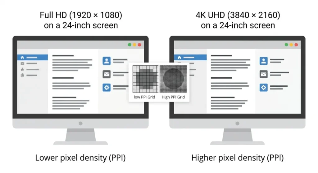
It is also worth knowing that resolution and pixel density are not the same thing. Resolution tells you how many pixels there are. Pixel density tells you how tightly those pixels are packed into the screen area. A small phone can look sharper than a large monitor even when the numbers do not seem wildly different, because the pixels are packed more tightly together.
Pixel Density (PPI) — Why Some Screens Look Sharper
Pixel density, measured in PPI (pixels per inch), tells you how tightly pixels are packed on a screen. You might also see DPI (dots per inch) used in some contexts. Technically, DPI is used for printers, while PPI refers to screens—but in everyday use, people often use them interchangeably.
I’ve tested devices where two screens had similar resolutions but looked completely different—because one had much higher pixel density. That’s why smaller screens like phones often look sharper than larger monitors.
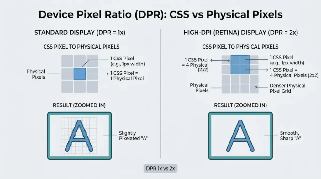
Device Pixel Ratio (DPR)
Device Pixel Ratio, or DPR, is the ratio between physical pixels and CSS pixels. According to MDN, devicePixelRatio is the ratio between physical pixels and CSS pixels on a display, which directly affects how content is rendered in the browser. In simple terms, it tells the browser how many real hardware pixels are being used to draw one CSS pixel on screen.
A classic desktop monitor might be close to 1 CSS pixel for 1 device pixel, while a high-density phone or laptop screen may use two, three, or even more physical pixels to draw a single CSS pixel. Without that adjustment, web pages would look tiny on dense displays or too large on older ones.
That’s really the core reason DPR exists in modern displays. It keeps text, buttons, icons, and layouts usable across devices with very different pixel densities.
A simple example helps. Suppose a phone has a physical resolution of 1170 × 2532 and a DPR of 3. That means the browser can treat the screen as if it were roughly 390 × 844 CSS pixels, while the hardware still uses the full 1170 × 2532 pixel grid underneath. That is why websites can stay readable instead of shrinking into a tiny, hard-to-tap mess.
This is also why people searching for “what is my screen size in pixels” often see different values depending on whether they’re looking at device specs or browser-reported values.
Why DPR Became Necessary
DPR became important when high-density screens started becoming normal. As displays got sharper, a one-to-one pixel mapping stopped making sense for web design. If the browser treated every physical pixel as a separate layout unit, everything on a modern high-density screen would appear far too small.
That is why DPR is not just a technical detail. It is part of the reason the web still feels comfortable on phones, tablets, laptops, and desktops at the same time. It lets browsers render a design at a stable visual size while still taking advantage of extra physical pixels for clarity.
You’ll often hear terms like “Retina display” (Apple) or HiDPI, which refer to screens with very high pixel density where individual pixels are hard to distinguish.
A nice side effect is that images and text look cleaner on high-density screens. The browser has more hardware pixels available to draw smoother curves, crisper letters, and better anti-aliased edges. So DPR helps both usability and visual quality.
After testing dozens of screen configurations and browser behaviors, I’ve found that most confusion comes from how devices report resolution differently—not from the resolution itself.
I update this tool regularly as new devices and display behaviors evolve, because even small changes in how browsers report resolution can confuse users.
Display Technology Matters Too
Screen resolution is important, but it is only part of the story. Two displays can both be 4K and still look very different because the underlying display technology affects contrast, brightness, color, and motion handling.
Wide Color Gamut
Wide color gamut, or WCG, means a display can reproduce a wider range of colors than a standard display. In plain English, WCG is about richer and more accurate color, not just more pixels.
This matters because a high-resolution screen with weak color coverage can still look dull. A screen that has both good resolution and a strong color gamut usually feels more vibrant, especially for video, design, and photography work.
OLED
OLED stands for Organic Light Emitting Diode. That is why OLED screens are known for deep blacks, strong contrast, wide viewing angles, and fast response times.
This is a good reminder that resolution alone does not define image quality. A 4K OLED can look stunning because the pixels are not only dense, they also turn on and off individually. That creates the kind of contrast people notice right away, even if they never think about the technical side.
HDR
HDR, or High Dynamic Range, improves contrast and color accuracy compared with SDR, which is why it has become so popular for movies, gaming, and content creation.
For normal users, the practical takeaway is simple. HDR can make highlights brighter, shadows richer, and scenes more lifelike, but only when the display and the content are both set up properly. So a screen may be 4K, but if its HDR support is weak, the viewing experience may still feel flat.
Color Depth (Why Some Screens Show Richer Colors)
Color depth refers to how many colors a display can produce. Most modern screens use 24-bit color, which allows for over 16.7 million color variations (2⁴ × 2⁴ × 2⁴ combinations across RGB channels).
From what I’ve seen while testing different displays, color depth doesn’t get talked about much, but it quietly affects how smooth gradients and images look—especially in photos and videos.
How Screen Resolution Affects Daily Use
For everyday browsing and office work, Full HD still feels perfectly fine on many laptops and monitors. For more room to work and a cleaner look, 1440p is often the sweet spot. For people who edit photos, videos, or want very sharp text on a larger display, 4K can be worth it. That basic pattern shows up repeatedly in buying guides from Samsung and HP. I’ve seen the same pattern consistently while testing real devices, which is why those recommendations tend to hold up in everyday use—not just on spec sheets.
It also helps to match resolution to screen size. A low-resolution screen on a large panel can look soft, while a high-resolution screen on a very small panel may need scaling to stay readable. That is why display choice is really a balance between sharpness, workspace, comfort, and hardware power.
From my own testing, I usually recommend 1440p for most people using a 27-inch monitor. It consistently feels like the best balance between sharpness and usability without needing aggressive scaling adjustments.
If you want to go deeper or compare options, these guides will help:
- Display Resolution Explained (720p, 1080p, 1440p, 4K, 8K)
- What Is 2K Resolution (and why it’s confusing)
- QHD vs 4K (which should you choose?)
- HD vs FHD (real differences)
- How to Measure Monitor Size correctly
- HDR vs OLED (picture quality explained)
- Whatismyscreenresolution blog